Today, I’d like to show you a neat trick. We’ll create a document icon with pure CSS3. Even better, this effect will only require a single HTML element.
The Game Plan
- Create a square box
- Round the edges
- Use pseudo elements to create a curled corner
- Create the illusion of text with a striped gradient
Step 1: Create a Box
We’ll begin by adding our single HTML element: an anchor tag. This makes sense, as most icons also serve to be links.
1
| <a class="docIcon" href="#">Document Icon</a> |
display: block, since all anchor tags are inline, by default.
1
2
3
4
5
6
7
8
9
10
11
| .docIcon{ background:#eee; background: linear-gradient(top, #ddd 0, #eee 15%, #fff 40%, #fff 70%, #eee 100%); border:1px solid #ccc; display:block; width:40px; height:56px; position:relative; margin:42px auto;} |
1
2
3
4
5
6
7
8
9
10
11
12
13
14
| .docIcon { background: #eee; background: -webkit-linear-gradient(top, #ddd 0, #eee 15%, #fff 40%, #fff 70%, #eee 100%); background: -moz-linear-gradient(top, #ddd 0, #eee 15%, #fff 40%, #fff 70%, #eee 100%); background: -o-linear-gradient(top, #ddd 0, #eee 15%, #fff 40%, #fff 70%, #eee 100%); background: -ms-linear-gradient(top, #ddd 0, #eee 15%, #fff 40%, #fff 70%, #eee 100%); background: linear-gradient(top, #ddd 0, #eee 15%, #fff 40%, #fff 70%, #eee 100%); border: 1px solid #ccc; display: block; width: 40px; height: 56px; position: relative; margin: 42px auto;} |
text-indent property to hide the text.
1
2
3
4
5
6
7
8
| .docIcon{ ... -webkit-box-shadow:inset rgba(255,255,255,0.8) 0 1px 1px; -moz-box-shadow:inset rgba(255,255,255,0.8) 0 1px 1px; box-shadow:inset rgba(255,255,255,0.8) 0 1px 1px; text-indent:-9999em;} |
So Far, We Have:
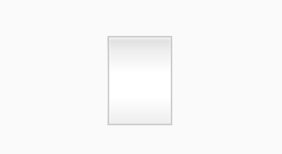
Step 2: Rounded Corners
Next, we need to create a rounded corner effect. Add the following:
1
2
3
4
5
6
7
| .docIcon{ ... -webkit-border-radius:3px 15px 3px 3px; -moz-border-radius:3px 15px 3px 3px; border-radius:3px 15px 3px 3px;} |
Which Gives Us…
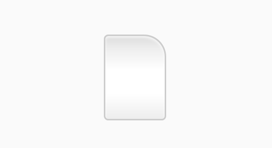
Step 3: One Curled Corner
To create the illusion of a curled corner, we’ll use generated content, or pseudo elements.First, add content
:before
our icon. In this case, we don’t require any specific text. Instead, we
need to create a 15px box, and apply a background gradient.
1
2
3
4
5
6
7
8
9
10
11
12
13
14
15
16
17
18
19
20
| .docIcon:before { content: ""; display: block; position: absolute; top: 0; right: 0; width: 15px; height: 15px; background: #ccc; background: -webkit-linear-gradient(45deg, #fff 0, #eee 50%, #ccc 100%); background: -moz-linear-gradient(45deg, #fff 0, #eee 50%, #ccc 100%); background: -o-linear-gradient(45deg, #fff 0, #eee 50%, #ccc 100%); background: -ms-linear-gradient(45deg, #fff 0, #eee 50%, #ccc 100%); background: linear-gradient(45deg, #fff 0, #eee 50%, #ccc 100%); -webkit-box-shadow: rgba(0,0,0,0.05) -1px 1px 1px, inset white 0 0 1px; -moz-box-shadow: rgba(0,0,0,0.05) -1px 1px 1px, inset white 0 0 1px; box-shadow: rgba(0,0,0,0.05) -1px 1px 1px, inset white 0 0 1px; border-bottom: 1px solid #ccc; border-left: 1px solid #ccc;} |
1
2
3
4
| ...-webkit-border-radius:3px 15px 3px 3px;-moz-border-radius:3px 15px 3px 3px;border-radius:3px 15px 3px 3px; |
Tada!
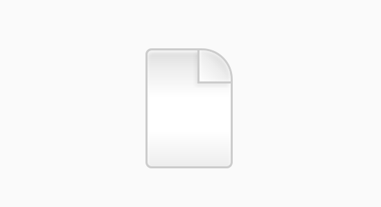
Step 4: Adding Lines
Next, we’re going to use the:after psuedo element to add some dashed lines to represent zoomed out text. Apply a width of 60%, and a margin-left and margin-right of 20% (which equals 100%). Next, we specify a height and position it at 0 0.
1
2
3
4
5
6
7
8
9
10
11
| .docIcon:after{ content:""; display:block; position:absolute; left:0; top:0; width:60%; margin:22px 20% 0; height:15px;} |
Multiple Lines (Stripes) with CSS3 Gradienst
1
2
3
4
5
6
7
8
9
10
| .docIcon:after{ ... background:#ccc; background: -webkit-linear-gradient(top, #ccc 0, #ccc 20%, #fff 20%, #fff 40%, #ccc 40%, #ccc 60%, #fff 60%, #fff 80%, #ccc 80%, #ccc 100%); background: -moz-linear-gradient(top, #ccc 0, #ccc 20%, #fff 20%, #fff 40%, #ccc 40%, #ccc 60%, #fff 60%, #fff 80%, #ccc 80%, #ccc 100%); background: -o-linear-gradient(top, #ccc 0, #ccc 20%, #fff 20%, #fff 40%, #ccc 40%, #ccc 60%, #fff 60%, #fff 80%, #ccc 80%, #ccc 100%); background: -ms-linear-gradient(top, #ccc 0, #ccc 20%, #fff 20%, #fff 40%, #ccc 40%, #ccc 60%, #fff 60%, #fff 80%, #ccc 80%, #ccc 100%); background:linear-gradient(top, #ccc 0, #ccc 20%, #fff 20%, #fff 40%, #ccc 40%, #ccc 60%, #fff 60%, #fff 80%, #ccc 80%, #ccc 100%);} |
No comments:
Post a Comment