Showing posts with label Professional Web Design. Show all posts

Create Your Own Juicy Tabbed Slider

Thanks again i'm back with a very helpful tutorial of Slider for Your Website. We’ll be using the popular Nivo Slider to handle the animation, so let’s dig in!  

Download Source Files 

Demo View It Online


Let’s Dig In!

Alright, so assuming that you’ve gone through the design phase of this tutorial, now you should have a pretty basic slider element in Photoshop (or Fireworks) format. I’m going to write up this tutorial as a “standalone” slider – meaning it’ll essentially be the only element on the page that we create… but using just a few extra steps after the fact, you should be able to add this to your own designs and position/resize it any way that you want!
What’s better is that this is completely skinnable and resizable – so if you’ve made any heavy customizations in the free PSD that we handed out, you’ll be able to incorporate your franken-modifications here as well!

Step 1: Download the Nivo Slider
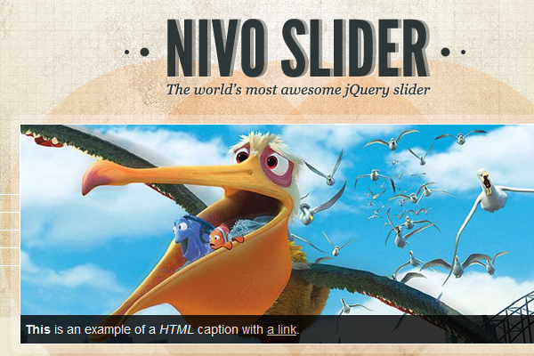

Go ahead and download the latest version of the Nivo Slider from their page. The version we’ll be using is Version 2.4, but unless they completely overhaul their entire codebase, chances are very good that the steps in this tutorial will still work in version 2.5, 2.6, and ever onward.
It’s important to note that we’re not re-inventing the wheel here. We’re pretty much just going to be using their “demo.html” file as our own base of operations. We won’t deviate far from the official Usage Documentation either.
As a web designer, I do a lot of work where I’m simply modifying and hijacking other people’s open source code – you probably do the same. It’s an important skill to have unless you’re intent on learning each and every major coding language out there and you’re willing to constantly keep your knowledge up to date. Frankly, I think that’s kind of silly – so figuring out how to use other people’s code is one of the most important skills that you can have.
In most cases (as in this one), all that’s truly required is a rough knowledge of HTML and CSS and the ability to read documentation.
We’ll start out the next step by opening up the “demo” folder – so go ahead and do that before we move on.

Step 2: Understanding the Basic Setup

In this step, we’re simply going to attempt to get an idea for how the Nivo Slider works. Every slider out there is going to work a little bit different, so it’s worth taking a few minutes to familiarize yourself with the particular script that you intend to use on a project.
If you take a quick look at the code for the Nivo Slider (inside the demo.html file), you’ll notice that all of the major styling and structure is being handled from the “style.css” file. In fact, the actual HTML code is pretty simple once you’ve referenced the appropriate scripts in the HEAD section of demo.html.
Let’s start our walkthrough by looking at the lines of code from the header. We won’t need to change these, but they need to be present in any file that we want to use the slider on:
  1. <!-- Usually in the <head> section -->  
  2. <link rel="stylesheet" href="nivo-slider.css" type="text/css" media="screen" />  
  3. <script src="http://ajax.googleapis.com/ajax/libs/jquery/1.4.2/jquery.min.js"></script>  
  4. <script src="jquery.nivo.slider.pack.js"></script>  
Next, let’s peek at the raw HTML that generates the slider:
  1. <!-- Then somewhere in the <body> section -->  
  2. <div id="slider">  
  3.     <img src="images/slide1.jpg" alt="" />  
  4.     <a href="http://dev7studios.com">  
  5.         <img src="images/slide2.jpg" alt="" title="#htmlcaption" />  
  6.     </a>  
  7.     <img src="images/slide3.jpg" alt="" title="This is an example of a caption" />  
  8.     <img src="images/slide4.jpg" alt="" />  
  9. </div>  
Finally, we won’t be dealing with captions in this particular slider, so you can pretty much disregard the next lines (unless you want to do your own customization of the slider later on):
  1. <div id="htmlcaption" class="nivo-html-caption">  
  2.     <strong>This</strong> is an example of a <em>HTML</em> caption with <a href="#">a link</a>.  
  3. </div>  
So, really, all that’s required for you to understand is the basic HTML that generates the slider (shown above in the second block of code). Since we won’t be dealing with captions in our slider, you can further simplify the code to something like this:
  1. <div id="slider-wrapper">  
  2.     <div id="slider">  
  3.         <img src="images/slide1.jpg" alt="" />  
  4.         <img src="images/slide2.jpg" alt="" />  
  5.         <img src="images/slide3.jpg" alt="" />  
  6.         <img src="images/slide4.jpg" alt="" />  
  7.     </div>  
  8. </div>  
That’s not so bad right? It’s essentially just a couple wrapped DIV elements with images inside.

The CSS for the Nivo Slider

The CSS is what’s going to be doing the heavy lifting, so let’s take a peek at that:
  1. /*============================*/  
  2. /*=== Custom Slider Styles ===*/  
  3. /*============================*/  
  4. #slider-wrapper {  
  5.     background:url(images/slider.png) no-repeat;  
  6.     width:998px;  
  7.     height:392px;  
  8.     margin:0 auto;  
  9.     padding-top:74px;  
  10.     margin-top:50px;  
  11. }  
  12.   
  13. #slider {  
  14.     position:relative;  
  15.     width:618px;  
  16.     height:246px;  
  17.     margin-left:190px;  
  18.     background:url(images/loading.gif) no-repeat 50% 50%;  
  19. }  
  20. #slider img {  
  21.     position:absolute;  
  22.     top:0px;  
  23.     left:0px;  
  24.     display:none;  
  25. }  
  26. #slider a {  
  27.     border:0;  
  28.     display:block;  
  29. }  
  30.   
  31. .nivo-controlNav {  
  32.     position:absolute;  
  33.     left:260px;  
  34.     bottombottom:-42px;  
  35. }  
  36. .nivo-controlNav a {  
  37.     display:block;  
  38.     width:22px;  
  39.     height:22px;  
  40.     background:url(images/bullets.png) no-repeat;  
  41.     text-indent:-9999px;  
  42.     border:0;  
  43.     margin-right:3px;  
  44.     float:left;  
  45. }  
  46. .nivo-controlNav a.active {  
  47.     background-position:0 -22px;  
  48. }  
  49.   
  50. .nivo-directionNav a {  
  51.     display:block;  
  52.     width:30px;  
  53.     height:30px;  
  54.     background:url(images/arrows.png) no-repeat;  
  55.     text-indent:-9999px;  
  56.     border:0;  
  57. }  
  58. a.nivo-nextNav {  
  59.     background-position:-30px 0;  
  60.     rightright:15px;  
  61. }  
  62. a.nivo-prevNav {  
  63.     left:15px;  
  64. }  
  65.   
  66. .nivo-caption {  
  67.     text-shadow:none;  
  68.     font-familyHelveticaArialsans-serif;  
  69. }  
  70. .nivo-caption a {   
  71.     color:#efe9d1;  
  72.     text-decoration:underline;  
  73. }  
If you’re new to CSS, this might look intimidating at first… but most of you will see this for a fairly simple bit of styling code. Everything you need to resize and reskin the slider is here… and we only need to change a handful of lines of script to get this thing looking exactly like our version.
First though, we need to locate and re-skin the images that are currently being used for the slider with our own. If you open up the “/demo/images/” folder, you’ll see there’s just a couple main images that we want to reskin:
  • arrows.png (the Left / Right arrows)
  • bullets.png (the Dot indicators)
  • slider.png (the background frame)
  • background.png (optional)
  • loading.png (optional)

Re-skinning the Assets

If we were coding this slider from scratch, we’d probably start by carefully chopping it in Photoshop, piece by piece. However, since we’re working with a pre-existing set of “assets” (aka, the images used to create the background, bullets and arrows), it’s going to make a little bit more sense to skin the pre-existing assets rather than start from scratch.

Reskin the Bullets

Let’s start with the “bullets.png” file since it happens to be the most straight forward file. Go ahead and open it up in Photoshop:

Notice the basic structure of the file here. There are two graphics that will be positioned using CSS so that one appears at a time.
We already have our own bullet graphics from our own PSD, so we simply want to position them over the original elements and re-save the file:
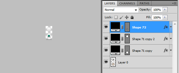
In this case, we don’t even need to re-size the file at all… so we’re actually done reskinning the bullets! Save this new file over the original “bullets.png”.

Reskin the Arrows

The arrows are going to be one level more difficult, simply because our arrow graphics are larger than the original graphics. That’s fine though – we’ll still start by opening up the “arrows.png” file inside Photoshop.
It’s hard to see the arrows because they are transparent.
Once again, notice the structure of the file – two arrows, side by side this time – that will be positioned using CSS so that only one appears at a time.
The size of the graphic is 60x30px… but ours will have to be large enough to hold both of our bigger arrows. Having measured our own arrows (you can do this using the Rectangular Marquee tool and the Info panel), I’ve decided that the new dimensions should be 70x65px. This will be large enough to hold both arrows, as well as the light shadow that we want to appear next to each one.
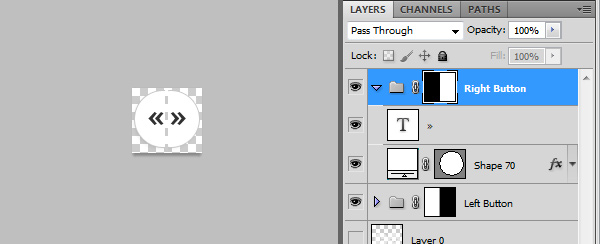
We’re going to have to make a few changes to the size and positioning in the CSS, but this completes the initial reskin for the arrows. Save this new file over the original “arrows.png”.

Reskin the Background

Lastly, let’s re-skin the background graphic. The Nivo Slider demo uses an abstract sort of circle background – but we want to use our “frame and shadow” graphic for the background.
This swap is going to be similar to what we did with the arrows, but instead of needing to make our image larger, this time we actually need to save a smaller document. Notice how large the original image is:
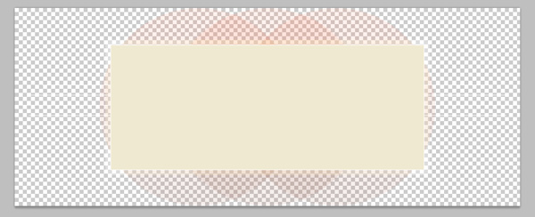
998x392px – Scaled Down for the Site.
998x392px is the original background’s dimensions – We want it to be closer to 494x310px to match our own frame. This isn’t tough, but it’s a case where it’s going to make more sense just to grab a direct slice from our original PSD file.
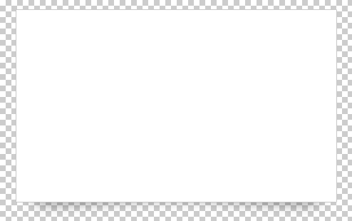
Go ahead and turn off ALL layers (including the background) other than the frame and the shadow, then Crop the image down to about 20-25px of spacing around the frame just to be safe (we won’t want to accidentally crop our shadow):
As with the last two graphics, go ahead and save directly over the original image “slider.png”.

Save Our Image Slides

The original slider uses images that are 618×246 in size. Our slider uses images that are 430x250px though, so we need to save over the original slide images using our own cropped in versions. You can obviously use your own images here… but for the sake of simplicity, I’ve just cropped in the Pixar images that the demo used.
If you did want to use your own images, obviously you’ll want to name them uniquely (my_image1.jpg, my_image2.jpg, etc.), and then amend the image paths inside the demo.html document.

Tweaking the CSS to Fit Our New Skinned Images

The last step here is probably the trickiest as it requires a lot of trial and error. Our objective is going to be to tweak the original style.css file so that our slider matches our own design. The primary problem is that the original slider uses completely different dimensions for most of the major elements, so we need to carefully, through trial and error, sort out what our own dimensions should be.
Trial and Error in CSS can be done a few different ways – The “hard” way is to simply keep on tweaking the CSS file, saving it, and then previewing it in the browser. The easy way is to use a browser plugin like Firebug to actually test out your adjustments in the browser itself. If you haven’t picked up Firebug yet, I highly recommend doing so now. It’s a simple plugin that attaches to your browser.
I’m going to simply dish out the completed CSS file right now, then we’ll break it down step by step. I’ll mark every major line that was edited with a “/*= NEW =*/” note:
  1. /*============================*/  
  2. /*=== Custom Slider Styles ===*/  
  3. /*============================*/  
  4. #slider-wrapper {  
  5.     background:url(images/slider.png) no-repeat;  
  6.     width:494px/*= NEW =*/  
  7.     height:310px;  /*= NEW =*/  
  8.     margin:0 auto;  
  9.     padding-top:23px/*= NEW =*/  
  10.     margin-top:50px;  
  11. }  
  12.   
  13. #slider {  
  14.     position:relative;  
  15.     width:430px;  /*= NEW =*/  
  16.     height:250px;  /*= NEW =*/  
  17.     margin-left:32px;  /*= NEW =*/  
  18.     background:url(images/loading.gif) no-repeat 50% 50%;  
  19. }  
  20. #slider img {  
  21.     position:absolute;  
  22.     top:0px;  
  23.     left:0px;  
  24.     display:none;  
  25. }  
  26. #slider a {  
  27.     border:0;  
  28.     display:block;  
  29. }  
  30.   
  31. .nivo-controlNav {  
  32.     position:absolute;  
  33.     left:163px;  /*= NEW =*/  
  34.     bottombottom:12px;  /*= NEW =*/  
  35.     background#000000;  /*= NEW =*/  
  36.     -moz-border-radius: 10px;  /*= NEW =*/  
  37.     -webkit-border-radius: 10px;  /*= NEW =*/  
  38.     padding3px;  /*= NEW =*/  
  39.     border2px solid #CCC;  /*= NEW =*/  
  40.     opacity: 0.7;  /*= NEW =*/  
  41.     z-index: 99;  /*= NEW =*/  
  42.     }  
  43.       
  44.     .nivo-controlNav:hover{opacity: 1;}  /*= NEW =*/  
  45.       
  46. .nivo-controlNav a {  
  47.     display:block;  
  48.     width:22px;    
  49.     height:22px;   
  50.     background:url(images/bullets.png) no-repeat;  
  51.     text-indent:-9999px;  
  52.     border:0;  
  53.     margin-right:0px;  /*= NEW =*/  
  54.     float:left;  
  55. }  
  56. .nivo-controlNav a.active {  
  57.     background-position:0 -22px;  
  58. }  
  59.   
  60. .nivo-directionNav a {  
  61.     display:block;  
  62.     width:35px;  /*= NEW =*/  
  63.     height:65px;  /*= NEW =*/  
  64.     background:url(images/arrows.png) no-repeat;  
  65.     text-indent:-9999px;  
  66.     border:0;  
  67. }  
  68. a.nivo-nextNav {  
  69.     background-position:-35px 0;  /*= NEW =*/  
  70.     rightright: -40px;  /*= NEW =*/  
  71. }  
  72.   
  73. a.nivo-nextNav:hover{rightright: -41px;}  /*= NEW =*/  
  74.   
  75. a.nivo-prevNav {  
  76.     left:-40px;  /*= NEW =*/  
  77. }  
  78. a.nivo-prevNav:hover{left: -41px;}  /*= NEW =*/  
  79.   
  80. .nivo-caption {  
  81.     text-shadow:none;  
  82.     font-familyHelveticaArialsans-serif;  
  83. }  
  84. .nivo-caption a {   
  85.     color:#efe9d1;  
  86.     text-decoration:underline;  
  87. }  
  88.   
  89. .nivo-directionNav a{top: 40%;}  /*= NEW =*/  
Looking closely, you’ll notice that all of the changes (with the “/*= NEW =*/” note) fall into the same basic categories:
  • Width
  • Height
  • Positioning (left, right, top, bottom)
The only two exceptions are where we’ve added the background color and rounded corners to the “.nivo-controlNav” element and where we’ve adjusted the default positioning of the “.nivo-directionNav a” element (this second one was previously set by another stylesheet, so we’re overriding the default setting of 45% so our arrows are higher up on the slider).
The other new rule that we’ve added is the “a.nivo-prevNav:hover{left: -41px;}” rules for the left and right buttons. The purpose here is to add a subtle nudge to each button when you mouse over them.
If you’re planning on creating your own resized version of the slider, you’ll want to pay attention to the two spots where the overall height and width of the slider are set. In short, the “#slider-wrapper” and “#slider” elements are what control this – simply adjust the height and width parameters to match your own slider’s dimensions and you should be good to go.

Last Step – UnHiding the Left/Right Arrows

The final modification that I’ve decided to make from the original demo.html file is to unhide the arrow buttons. By default, the Nivo Slide hides these “directional” navigation controls – only showing them when your mouse is hovering over the slider. For us though, these elements are a key aesthetic that we wouldn’t want to hide.
To correct this, the Nivo Slider gives us a simple method of unhiding by adding a single option to the activation script. At the bottom of the demo.html file, find the following:
  1. <script>  
  2.     $(window).load(function() {  
  3.        $('#slider').nivoSlider();  
  4.    });  
  5.      
Now simply add the following option:
  1. directionNavHide:false  
So that the revised code looks like this:
  1. <script>  
  2.     $(window).load(function() {  
  3.         $('#slider').nivoSlider({directionNavHide:false});  
  4.     });  
  5.       
  6.   
  7. There is a full list of customizations that you can make through this method - check out the <a href="http://nivo.dev7studios.com/#usage" onclick="javascript:_gaq.push(['_trackEvent','outbound-article','nivo.dev7studios.com']);">Usage Page on Nivo Slider's</a> website for more notes.  
Conclusion

That’s it for this tutorial! While we haven’t coded a single thing from scratch, we have effective created a custom slider and then realized it in code using one of the best pre-built slider scripts out there on the net right now. I hope you’ve picked up a few new skills in this walkthrough – have fun customizing this and using it in your own design!

30 CSS Selectors you Must Memorize

1. *

  1. * {  
  2.  margin: 0;  
  3.  padding: 0;  
  4. }  
Let’s knock the obvious ones out, for the beginners, before we move onto the more advanced selectors.
The star symbol will target every single element on the page. Many developers will use this trick to zero out the margins and padding. While this is certainly fine for quick tests, I’d advise you to never use this in production code. It adds too much weight on the browser, and is unnecessary.
The * can also be used with child selectors.
  1. #container * {  
  2.  border1px solid black;  
  3. }  
This will target every single element that is a child of the #container div. Again, try not to use this technique very much, if ever.
View Demo

Compatibility

  • IE6+
  • Firefox
  • Chrome
  • Safari
  • Opera

2. #X

  1. #container {  
  2.    width960px;  
  3.    marginauto;  
  4. }  
Prefixing the hash symbol to a selector allows us to target by id. This is easily the most common usage, however be cautious when using id selectors.
Ask yourself: do I absolutely need to apply an id to this element in order to target it?
id selectors are rigid and don’t allow for reuse. If possible, first try to use a tag name, one of the new HTML5 elements, or even a pseudo-class.
View Demo

Compatibility

  • IE6+
  • Firefox
  • Chrome
  • Safari
  • Opera

3. .X

  1. .error {  
  2.   colorred;  
  3. }  
This is a class selector. The difference between ids and classes is that, with the latter, you can target multiple elements. Use classes when you want your styling to apply to a group of elements. Alternatively, use ids to find a needle-in-a-haystack, and style only that specific element.
View Demo

Compatibility

  • IE6+
  • Firefox
  • Chrome
  • Safari
  • Opera

4. X Y

  1. li a {  
  2.   text-decorationnone;  
  3. }  
The next most comment selector is the descendant selector. When you need to be more specific with your selectors, you use these. For example, what if, rather than targeting all anchor tags, you only need to target the anchors which are within an unordered list? This is specifically when you’d use a descendant selector.
Pro-tip – If your selector looks like X Y Z A B.error, you’re doing it wrong. Always ask yourself if it’s absolutely necessary to apply all of that weight.
View Demo

Compatibility

  • IE6+
  • Firefox
  • Chrome
  • Safari
  • Opera

5. X

  1. a { colorred; }  
  2. ul { margin-left: 0; }  
What if you want to target all elements on a page, according to their type, rather than an id or classname? Keep it simple, and use a type selector. If you need to target all unordered lists, use ul {}.
View Demo

Compatibility

  • IE6+
  • Firefox
  • Chrome
  • Safari
  • Opera

6. X:visited and X:link

  1. a:link { colorred; }  
  2. a:visted { colorpurple; }  
We use the :link pseudo-class to target all anchors tags which have yet to be clicked on.
Alternatively, we also have the :visited pseudo class, which, as you’d expected, allows us to apply specific styling to only the anchor tags on the page which have been clicked on, or visited.
View Demo

Compatibility

  • IE7+
  • Firefox
  • Chrome
  • Safari
  • Opera

7. X + Y

  1. ul + p {  
  2.    colorred;  
  3. }  
This is referred to as an adjacent selector. It will select only the element that is immediately preceded by the former element. In this case, only the first paragraph after each ul will have red text.
View Demo

Compatibility

  • IE7+
  • Firefox
  • Chrome
  • Safari
  • Opera

8. X > Y

  1. div#container > ul {  
  2.   border1px solid black;  
  3. }  
The difference between the standard X Y and X > Y is that the latter will only select direct children. For example, consider the following markup.
  1. <div id="container">  
  2.    <ul>  
  3.       <li> List Item  
  4.         <ul>  
  5.            <li> Child </li>  
  6.         </ul>  
  7.       </li>  
  8.       <li> List Item </li>  
  9.       <li> List Item </li>  
  10.       <li> List Item </li>  
  11.    </ul>  
  12. </div>  
A selector of #container > ul will only target the uls which are direct children of the div with an id of container. It will not target, for instance, the ul that is a child of the first li.
For this reason, there are performance benefits in using the child combinator. In fact, it’s recommended particularly when working with JavaScript-based CSS selector engines.
View Demo

Compatibility

  • IE7+
  • Firefox
  • Chrome
  • Safari
  • Opera

9. X ~ Y

  1. ul ~ p {  
  2.    colorred;  
  3. }  
This sibling combinator is similar to X + Y, however, it’s less strict. While an adjacent selector (ul + p) will only select the first element that is immediately preceded by the former selector, this one is more generalized. It will select, referring to our example above, any p elements, as long as they follow a ul.
View Demo

Compatibility

  • IE7+
  • Firefox
  • Chrome
  • Safari
  • Opera

10. X[title]

  1. a[title] {  
  2.    colorgreen;  
  3. }  
Referred to as an attributes selector, in our example above, this will only select the anchor tags that have a title attribute. Anchor tags which do not will not receive this particular styling. But, what if you need to be more specific? Well…
View Demo

Compatibility

  • IE7+
  • Firefox
  • Chrome
  • Safari
  • Opera

11. X[href="foo"]

  1. a[href="http://net.tutsplus.com"] {  
  2.   color#1f6053/* nettuts green */  
  3. }  
The snippet above will style all anchor tags which link to http://net.tutsplus.com; they’ll receive our branded green color. All other anchor tags will remain unaffected.
Note that we’re wrapping the value in quotes. Remember to also do this when using a JavaScript CSS selector engine. When possible, always use CSS3 selectors over unofficial methods.
This works well, though, it’s a bit rigid. What if the link does indeed direct to Nettuts+, but, maybe, the path is nettuts.com rather than the full url? In those cases we can use a bit of the regular expressions syntax.
View Demo

Compatibility

  • IE7+
  • Firefox
  • Chrome
  • Safari
  • Opera

12. X[href*="nettuts"]

  1. a[href*="tuts"] {  
  2.   color#1f6053/* nettuts green */  
  3. }  
There we go; that’s what we need. The star designates that the proceeding value must appear somewhere in the attribute’s value. That way, this covers nettuts.com, net.tutsplus.com, and even tutsplus.com.
Keep in mind that this is a broad statement. What if the anchor tag linked to some non-Envato site with the string tuts in the url? When you need to be more specific, use ^ and &, to reference the beginning and end of a string, respectively.
View Demo

Compatibility

  • IE7+
  • Firefox
  • Chrome
  • Safari
  • Opera

13. X[href^="http"]

  1. a[href^="http"] {  
  2.    backgroundurl(path/to/external/icon.png) no-repeat;  
  3.    padding-left10px;  
  4. }  
Ever wonder how some websites are able to display a little icon next to the links which are external? I’m sure you’ve seen these before; they’re nice reminders that the link will direct you to an entirely different website.
This is a cinch with the carat symbol. It’s most commonly used in regular expressions to designate the beginning of a string. If we want to target all anchor tags that have a href which begins with http, we could use a selector similar to the snippet shown above.
Notice that we’re not searching for http://; that’s unnecessary, and doesn’t account for the urls that begin with https://.
Now, what if we wanted to instead style all anchors which link to, say, a photo? In those cases, let’s search for the end of the string.
View Demo

Compatibility

  • IE7+
  • Firefox
  • Chrome
  • Safari
  • Opera

14. X[href$=".jpg"]

  1. a[href$=".jpg"] {  
  2.    colorred;  
  3. }  
Again, we use a regular expressions symbol, $, to refer to the end of a string. In this case, we’re searching for all anchors which link to an image — or at least a url that ends with .jpg. Keep in mind that this certainly won’t work for gifs and pngs.
View Demo

Compatibility

  • IE7+
  • Firefox
  • Chrome
  • Safari
  • Opera

15. X[data-*="foo"]

  1. a[data-filetype="image"] {  
  2.    colorred;  
  3. }  
Refer back to number eight; how do we compensate for all of the various image types: png, jpeg,jpg, gif? Well, we could create multiple selectors, such as:
  1. a[href$=".jpg"],  
  2. a[href$=".jpeg"],  
  3. a[href$=".png"],  
  4. a[href$=".gif"] {  
  5.    colorred;  
  6. }  
But, that’s a pain in the butt, and is inefficient. Another possible solution is to use custom attributes. What if we added our own data-filetype attribute to each anchor that links to an image?
  1. <a href="path/to/image.jpg" data-filetype="image"> Image Link </a>  
Then, with that hook in place, we can use a standard attributes selector to target only those anchors.
  1. a[data-filetype="image"] {  
  2.    colorred;  
  3. }  
View Demo

Compatibility

  • IE7+
  • Firefox
  • Chrome
  • Safari
  • Opera

16. X[foo~="bar"]

  1.  a[data-info~="external"] {  
  2.    colorred;  
  3. }  
  4. a[data-info~="image"] {  
  5.    border1px solid black;  
  6. }  
Here’s a special one that’ll impress your friends. Not too many people know about this trick. The tilda (~) symbol allows us to target an attribute which has a spaced-separated list of values.
Going along with our custom attribute from number fifteen, above, we could create a data-info attribute, which can receive a space-separated list of anything we need to make note of. In this case, we’ll make note of external links and links to images — just for the example.
  1. "<a href="path/to/image.jpg" data-info="external image"> Click Me, Fool </a>  
With that markup in place, now we can target any tags that have either of those values, by using the ~ attributes selector trick.
  1. /* Target data-info attr that contains the value "external" */  
  2. a[data-info~="external"] {  
  3.    colorred;  
  4. }  
  5. /* And which contain the value "image" */  
  6. a[data-info~="image"] {  
  7.   border1px solid black;  
  8. }  
Pretty nifty, ay?
View Demo

Compatibility

  • IE7+
  • Firefox
  • Chrome
  • Safari
  • Opera

17. X:checked

  1. input[type=radio]:checked {  
  2.    border1px solid black;  
  3. }  
This pseudo class will only target a user interface element that has been checked - like a radio button, or checkbox. It's as simple as that.
View Demo

Compatibility

  • IE9+
  • Firefox
  • Chrome
  • Safari
  • Opera

18. X:after

The before and after pseudo classes kick butt. Every day, it seems, people are finding new and creative ways to use them effectively. They simply generate content around the selected element.
Many were first introduced to these classes when they encountered the clear-fix hack.
  1. .clearfix:after {  
  2.     content"";  
  3.     displayblock;  
  4.     clearboth;  
  5.     visibilityhidden;  
  6.     font-size: 0;  
  7.     height: 0;  
  8.     }  
  9. .clearfix {  
  10.    *displayinline-block;  
  11.    _height: 1%;  
  12. }  
This hack uses the :after pseudo class to append a space after the element, and then clear it. It's an excellent trick to have in your tool bag, particularly in the cases when the overflow: hidden; method isn't possible.
For another creative use of this, refer to my quick tip on creating shadows.
According to the CSS3 Selectors specification, you should technically use the pseudo element syntax of two colons ::. However, to remain compatible, the user-agent will accept a single colon usage as well. In fact, at this point, it's smarter to use the single-colon version in your projects.

Compatibility

  • IE8+
  • Firefox
  • Chrome
  • Safari
  • Opera

19. X:hover

  1. div:hover {  
  2.   background#e3e3e3;  
  3. }  
Oh come on. You know this one. The official term for this is user action pseudo class. It sounds confusing, but it really isn't. Want to apply specific styling when a user hovers over an element? This will get the job done!
Keep in mind that older version of Internet Explorer don't respond when the :hover pseudo class is applied to anything other than an anchor tag.
You'll most often use this selector when applying, for example, a border-bottom to anchor tags, when hovered over.
  1. a:hover {  
  2.  border-bottom1px solid black;  
  3. }  
Pro-tip - border-bottom: 1px solid black; looks better than text-decoration: underline;.

Compatibility

  • IE6+ (In IE6, :hover must be applied to an anchor element)
  • Firefox
  • Chrome
  • Safari
  • Opera

20. X:not(selector)

  1. div:not(#container) {  
  2.    colorblue;  
  3. }  
The negation pseudo class is particularly helpful. Let's say I want to select all divs, except for the one which has an id of container. The snippet above will handle that task perfectly.
Or, if I wanted to select every single element (not advised) except for paragraph tags, we could do:
  1. *:not(p) {  
  2.   colorgreen;  
  3. }  
View Demo

Compatibility

  • IE9+
  • Firefox
  • Chrome
  • Safari
  • Opera

21. X::pseudoElement

  1. p::first-line {  
  2.    font-weightbold;  
  3.    font-size: 1.2em;  
  4. }  
We can use pseudo elements (designated by ::) to style fragments of an element, such as the first line, or the first letter. Keep in mind that these must be applied to block level elements in order to take effect.
A pseudo-element is composed of two colons: ::

Target the First Letter of a Paragraph

  1. p::first-letter {  
  2.    floatleft;  
  3.    font-size: 2em;  
  4.    font-weightbold;  
  5.    font-familycursive;  
  6.    padding-right2px;  
  7. }  
This snippet is an abstraction that will find all paragraphs on the page, and then sub-target only the first letter of that element.
This is most often used to create newspaper-like styling for the first-letter of an article.

Target the First Line of a Paragraph

  1. p::first-line {  
  2.    font-weightbold;  
  3.    font-size: 1.2em;  
  4. }  
Similarly, the ::first-line pseudo element will, as expected, style the first line of the element only.
"For compatibility with existing style sheets, user agents must also accept the previous one-colon notation for pseudo-elements introduced in CSS levels 1 and 2 (namely, :first-line, :first-letter, :before and :after). This compatibility is not allowed for the new pseudo-elements introduced in this specification." - Source
View Demo

Compatibility

  • IE6+
  • Firefox
  • Chrome
  • Safari
  • Opera

22. X:nth-child(n)

  1. li:nth-child(3) {  
  2.    colorred;  
  3. }  
Remember the days when we had no way to target specific elements in a stack? The nth-child pseudo class solves that!
Please note that nth-child accepts an integer as a parameter, however, this is not zero-based. If you wish to target the second list item, use li:nth-child(2).
We can even use this to select a variable set of children. For example, we could do li:nth-child(4n) to select every fourth list item.
View Demo

Compatibility

  • IE9+
  • Firefox 3.5+
  • Chrome
  • Safari

23. X:nth-last-child(n)

  1. li:nth-last-child(2) {  
  2.    colorred;  
  3. }  
What if you had a huge list of items in a ul, and only needed to access, say, the third to the last item? Rather than doing li:nth-child(397), you could instead use the nth-last-child pseudo class.
This technique works almost identically from number sixteen above, however, the difference is that it begins at the end of the collection, and works its way back.
View Demo

Compatibility

  • IE9+
  • Firefox 3.5+
  • Chrome
  • Safari
  • Opera

24. X:nth-of-type(n)

  1. ul:nth-of-type(3) {  
  2.    border1px solid black;  
  3. }  
There will be times when, rather than selecting a child, you instead need to select according to the type of element.
Imagine mark-up that contains five unordered lists. If you wanted to style only the third ul, and didn't have a unique id to hook into, you could use the nth-of-type(n) pseudo class. In the snippet above, only the third ul will have a border around it.
View Demo

Compatibility

  • IE9+
  • Firefox 3.5+
  • Chrome
  • Safari

25. X:nth-last-of-type(n)

  1. ul:nth-last-of-type(3) {  
  2.    border1px solid black;  
  3. }  
And yes, to remain consistent, we can also use nth-last-of-type to begin at the end of the selectors list, and work our way back to target the desired element.

Compatibility

  • IE9+
  • Firefox 3.5+
  • Chrome
  • Safari
  • Opera

26. X:first-child

  1. ul li:first-child {  
  2.    border-topnone;  
  3. }  
This structural pseudo class allows us to target only the first child of the element's parent. You'll often use this to remove borders from the first and last list items.
For example, let's say you have a list of rows, and each one has a border-top and a border-bottom. Well, with that arrangement, the first and last item in that set will look a bit odd.
Many designers apply classes of first and last to compensate for this. Instead, you can use these pseudo classes.
View Demo

Compatibility

  • IE7+
  • Firefox
  • Chrome
  • Safari
  • Opera

27. X:last-child

  1. ul > li:last-child {  
  2.    colorgreen;  
  3. }  
The opposite of first-child, last-child will target the last item of the element's parent.

Example

Let's build a simple example to demonstrate one possible use of these classes. We'll create a styled list item.

Markup

  1. <ul>  
  2.    <li> List Item </li>  
  3.    <li> List Item </li>  
  4.    <li> List Item </li>  
  5. </ul>  
Nothing special here; just a simple list.

CSS

  1. ul {  
  2.  width200px;  
  3.  background#292929;  
  4.  colorwhite;  
  5.  list-stylenone;  
  6.  padding-left: 0;  
  7. }  
  8. li {  
  9.  padding10px;  
  10.  border-bottom1px solid black;  
  11.  border-top1px solid #3c3c3c;  
  12. }  
This styling will set a background, remove the browser-default padding on the ul, and apply borders to each li to provide a bit of depth.
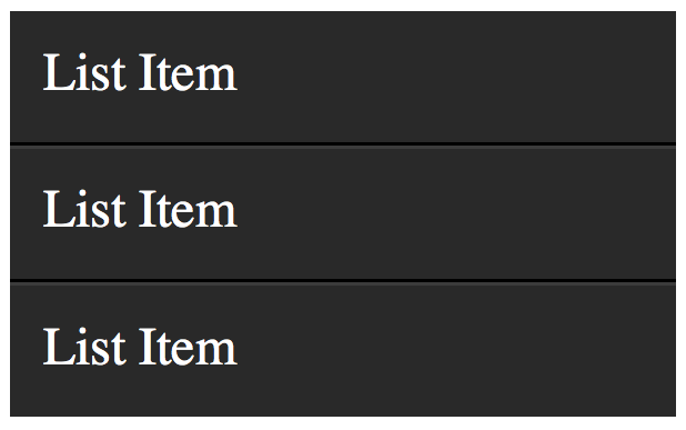
Styled List
To add depth to your lists, apply a border-bottom to each li that is a shade or two darker than the li's background color. Next, apply a border-top which is a couple shades lighter.
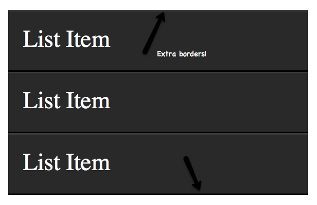
The only problem, as shown in the image above, is that a border will be applied to the very top and bottom of the unordered list - which looks odd. Let's use the :first-child and :last-child pseudo classes to fix this.
  1. li:first-child {  
  2.     border-topnone;  
  3. }  
  4. li:last-child {  
  5.    border-bottomnone;  
  6. }  
Fixed
There we go; that fixes it!
View Demo

Compatibility

  • IE9+
  • Firefox
  • Chrome
  • Safari
  • Opera
Yep - IE8 supported :first-child, but not :last-child. Go figure.

28. X:only-child

  1. div p:only-child {  
  2.    colorred;  
  3. }  
Truthfully, you probably won't find yourself using the only-child pseudo class too often. Nonetheless, it's available, should you need it.
It allows you to target elements which are the only child of its parent. For example, referencing the snippet above, only the paragraph that is the only child of the div will be colored, red.
Let's assume the following markup.
  1. <div><p> My paragraph here. </p></div>  
  2. <div>  
  3.    <p> Two paragraphs total. </p>  
  4.    <p> Two paragraphs total. </p>  
  5. </div>  
In this case, the second div's paragraphs will not be targeted; only the first div. As soon as you apply more than one child to an element, the only-child pseudo class ceases to take effect.
View Demo

Compatibility

  • IE9+
  • Firefox
  • Chrome
  • Safari
  • Opera

29. X:only-of-type

  1. li:only-of-type {  
  2.    font-weightbold;  
  3. }  
This structural pseudo class can be used in some clever ways. It will target elements that do not have any siblings within its parent container. As an example, let's target all uls, which have only a single list item.
First, ask yourself how you would accomplish this task? You could do ul li, but, this would target all list items. The only solution is to use only-of-type.
  1. ul > li:only-of-type {  
  2.    font-weightbold;  
  3. }  
View Demo

Compatibility

  • IE9+
  • Firefox 3.5+
  • Chrome
  • Safari
  • Opera

30. X:first-of-type

The first-of-type pseudo class allows you to select the first siblings of its type.

A Test

To better understand this, let's have a test. Copy the following mark-up into your code editor:
  1. <div>  
  2.    <p> My paragraph here. </p>  
  3.    <ul>  
  4.       <li> List Item 1 </li>  
  5.       <li> List Item 2 </li>  
  6.    </ul>  
  7.    <ul>  
  8.       <li> List Item 3 </li>  
  9.       <li> List Item 4 </li>  
  10.    </ul>  
  11. </div>  
Now, without reading further, try to figure out how to target only "List Item 2". When you've figured it out (or given up), read on.

Solution 1

There are a variety of ways to solve this test. We'll review a handful of them. Let's begin by using first-of-type.
  1. ul:first-of-type > li:nth-child(2) {  
  2.    font-weightbold;  
  3. }  
This snippet essentially says, "find the first unordered list on the page, then find only the immediate children, which are list items. Next, filter that down to only the second list item in that set.

Solution 2

Another option is to use the adjacent selector.
  1. p + ul li:last-child {  
  2.    font-weightbold;  
  3. }  
In this scenario, we find the ul that immediately proceeds the p tag, and then find the very last child of the element.

Solution 3

We can be as obnoxious or as playful as we want with these selectors.
  1. ul:first-of-type li:nth-last-child(1) {  
  2.    font-weightbold;  
  3. }  
This time, we grab the first ul on the page, and then find the very first list item, but starting from the bottom! :)
View Demo

Compatibility

  • IE9+
  • Firefox 3.5+
  • Chrome
  • Safari
  • Opera

28 HTML5 Features, Tips, and Techniques you Must Know

1. New Doctype

Still using that pesky, impossible-to-memorize XHTML doctype?
  1. <!DOCTYPE html PUBLIC "-//W3C//DTD XHTML 1.0 Transitional//EN"  
  2.     "http://www.w3.org/TR/xhtml1/DTD/xhtml1-transitional.dtd">  
If so, why? Switch to the new HTML5 doctype. You’ll live longer — as Douglas Quaid might say.
  1. <!DOCTYPE html>  
In fact, did you know that it truthfully isn’t even really necessary for HTML5? However, it’s used for current, and older browsers that require a specified doctype. Browsers that do not understand this doctype will simply render the contained markup in standards mode. So, without worry, feel free to throw caution to the wind, and embrace the new HTML5 doctype.

2. The Figure Element

Consider the following mark-up for an image:
  1. <img src="path/to/image" alt="About image" />  
  2. <p>Image of Mars. </p>  
There unfortunately isn’t any easy or semantic way to associate the caption, wrapped in a paragraph tag, with the image element itself. HTML5 rectifies this, with the introduction of the <figure> element. When combined with the <figcaption> element, we can now semantically associate captions with their image counterparts.
  1. <figure>  
  2.     <img src="path/to/image" alt="About image" />  
  3.     <figcaption>  
  4.         <p>This is an image of something interesting. </p>  
  5.     </figcaption>  
  6. </figure>  

3. <small> Redefined

Not long ago, I utilized the <small> element to create subheadings that are closely related to the logo. It’s a useful presentational element; however, now, that would be an incorrect usage. The small element has been redefined, more appropriately, to refer to small print. Imagine a copyright statement in the footer of your site; according to the new HTML5 definition of this element; the <small> would be the correct wrapper for this information.
The small element now refers to “small print.”

4. No More Types for Scripts and Links

You possibly still add the type attribute to your link and script tags.
  1. <link rel="stylesheet" href="path/to/stylesheet.css" type="text/css" />  
  2. <script type="text/javascript" src="path/to/script.js"></script>  
This is no longer necessary. It’s implied that both of these tags refer to stylesheets and scripts, respectively. As such, we can remove the type attribute all together.
  1. <link rel="stylesheet" href="path/to/stylesheet.css" />  
  2. <script src="path/to/script.js"></script>  

5. To Quote or Not to Quote.

…That is the question. Remember, HTML5 is not XHTML. You don’t have to wrap your attributes in quotation marks if you don’t want to you. You don’t have to close your elements. With that said, there’s nothing wrong with doing so, if it makes you feel more comfortable. I find that this is true for myself.
  1. <p class=myClass id=someId> Start the reactor.  
Make up your own mind on this one. If you prefer a more structured document, by all means, stick with the quotes.

6. Make your Content Editable

Content Editable
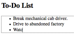
The new browsers have a nifty new attribute that can be applied to elements, called contenteditable. As the name implies, this allows the user to edit any of the text contained within the element, including its children. There are a variety of uses for something like this, including an app as simple as a to-do list, which also takes advantage of local storage.
  1. <!DOCTYPE html>  
  2. <html lang="en">  
  3. <head>  
  4.     <meta charset="utf-8">  
  5.     <title>untitled</title>  
  6. </head>  
  7. <body>  
  8.     <h2> To-Do List </h2>  
  9.      <ul contenteditable="true">  
  10.         <li> Break mechanical cab driver. </li>  
  11.         <li> Drive to abandoned factory  
  12.         <li> Watch video of self </li>  
  13.      </ul>  
  14. </body>  
  15. </html>  
Or, as we learned in the previous tip, we could write it as:
  1. <ul contenteditable=true>  

7. Email Inputs

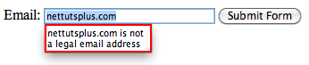
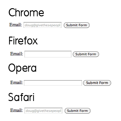
If we apply a type of “email” to form inputs, we can instruct the browser to only allow strings that conform to a valid email address structure. That’s right; built-in form validation will soon be here! We can’t 100% rely on this just yet, for obvious reasons. In older browsers that do not understand this “email” type, they’ll simply fall back to a regular textbox.
  1. <!DOCTYPE html>  
  2. <html lang="en">  
  3. <head>  
  4.     <meta charset="utf-8">  
  5.     <title>untitled</title>  
  6. </head>  
  7. <body>  
  8.     <form action="" method="get">  
  9.         <label for="email">Email:</label>  
  10.         <input id="email" name="email" type="email" />  
  11.         <button type="submit"> Submit Form </button>  
  12.     </form>  
  13. </body>  
  14. </html>  
Email Validation
At this time, we cannot depend on browser validation. A server/client side solution must still be implemented.
It should also be noted that all the current browsers are a bit wonky when it comes to what elements and attributes they do and don’t support. For example, Opera seems to support email validation, just as long as the name attribute is specified. However, it does not support the placeholder attribute, which we’ll learn about in the next tip. Bottom line, don’t depend on this form of validation just yet…but you can still use it!

8. Placeholders

Before, we had to utilize a bit of JavaScript to create placeholders for textboxes. Sure, you can initially set the value attribute how you see fit, but, as soon as the user deletes that text and clicks away, the input will be left blank again. The placeholder attribute remedies this.
  1. <input name="email" type="email" placeholder="doug@givethesepeopleair.com" />  
Again, support is shady at best across browsers, however, this will continue to improve with every new release. Besides, if the browser, like Firefox and Opera, don’t currently support the placeholder attribute, no harm done.
Validation

9. Local Storage

Thanks to local storage (not officially HTML5, but grouped in for convenience’s sake), we can make advanced browsers “remember” what we type, even after the browser is closed or is refreshed.
“localStorage sets fields on the domain. Even when you close the browser, reopen it, and go back to the site, it remembers all fields in localStorage.”
-QuirksBlog
While obviously not supported across all browsers, we can expect this method to work, most notably, in Internet Explorer 8, Safari 4, and Firefox 3.5. Note that, to compensate for older browsers that won’t recognize local storage, you should first test to determine whether window.localStorage exists.
Support matrix
via http://www.findmebyip.com/litmus/

10. The Semantic Header and Footer

Gone are the days of:
  1. <div id="header">  
  2.     ...  
  3. </div>  
  4. <div id="footer">  
  5.     ...  
  6. </div>  
Divs, by nature, have no semantic structure — even after an id is applied. Now, with HTML5, we have access to the <header> and <footer> elements. The mark-up above can now be replaced with:
  1. <header>  
  2.     ...  
  3. </header>  
  4. <footer>  
  5.     ...  
  6. </footer>  
It’s fully appropriate to have multiple headers and footers in your projects.
Try not to confuse these elements with the “header” and “footer” of your website. They simply refer to their container. As such, it makes sense to place, for example, meta information at the bottom of a blog post within the footer element. The same holds true for the header.

11. More HTML5 Form Features

Learn about more helpful HTML5 form features in this quick video tip.

12. Internet Explorer and HTML5

Unfortunately, that dang Internet Explorer requires a bit of wrangling in order to understand the new HTML5 elements.
All elements, by default, have a display of inline.
In order to ensure that the new HTML5 elements render correctly as block level elements, it’s necessary at this time to style them as such.
  1. header, footer, article, section, nav, menu, hgroup {  
  2.    displayblock;  
  3. }  
Unfortunately, Internet Explorer will still ignore these stylings, because it has no clue what, as an example, the header element even is. Luckily, there is an easy fix:
  1. document.createElement("article");  
  2. document.createElement("footer");  
  3. document.createElement("header");  
  4. document.createElement("hgroup");  
  5. document.createElement("nav");  
  6. document.createElement("menu");  
Strangely enough, this code seems to trigger Internet Explorer. To simply this process for each new application, Remy Sharp created a script, commonly referred to as the HTML5 shiv. This script also fixes some printing issues as well.
  1. <!--[if IE]>  
  2. <script src="http://html5shim.googlecode.com/svn/trunk/html5.js"></script>  
  3. <![endif]-->  

13. hgroup

Imagine that, in my site’s header, I had the name of my site, immediately followed by a subheading. While we can use an <h1> and <h2> tag, respectively, to create the mark-up, there still wasn’t, as of HTML4, an easy way to semantically illustrate the relationship between the two. Additionally, the use of an h2 tag presents more problems, in terms of hierarchy, when it comes to displaying other headings on the page. By using the hgroup element, we can group these headings together, without affecting the flow of the document’s outline.
  1. <header>  
  2.     <hgroup>  
  3.         <h1> Recall Fan Page </h1>  
  4.         <h2> Only for people who want the memory of a lifetime. </h2>  
  5.     </hgroup>  
  6. </header>  

14. Required Attribute

Forms allow for a new required attribute, which specifies, naturally, whether a particular input is required. Dependent upon your coding preference, you can declare this attribute in one of two ways:
  1. <input type="text" name="someInput" required>  
Or, with a more structured approach.
  1. <input type="text" name="someInput" required="required">  
Either method will do. With this code, and within browsers that support this attribute, a form cannot be submitted if that “someInput” input is blank. Here’s a quick example; we’ll also add the placeholder attribute as well, as there’s no reason not to.
  1. <form method="post" action="">  
  2.     <label for="someInput"> Your Name: </label>  
  3.     <input type="text" id="someInput" name="someInput" placeholder="Douglas Quaid" required>  
  4.     <button type="submit">Go</button>  
  5. </form>  
Required and Placeholder Attributes
If the input is left blank, and the form is submitted, the textbox will be highlighted.

15. Autofocus Attribute

Again, HTML5 removes the need for JavaScript solutions. If a particular input should be “selected,” or focused, by default, we can now utilize the autofocus attribute.
  1. <input type="text" name="someInput" placeholder="Douglas Quaid" required autofocus>  
Interestingly enough, while I personally tend to prefer a more XHTML approach (using quotation marks, etc.), writing "autofocus=autofocus" feels odd. As such, we’ll stick with the single keyword approach.

16. Audio Support

No longer do we have to rely upon third party plugins in order to render audio. HTML5 now offers the <audio> element. Well, at least, ultimately, we won’t have to worry about these plugins. For the time being, only the most recent of browsers offer support for HTML5 audio. At this time, it’s still a good practice to offer some form of backward compatibility.
  1. <audio autoplay="autoplay" controls="controls">  
  2.     <source src="file.ogg" />  
  3.     <source src="file.mp3" />  
  4.     <a href="file.mp3">Download this file.</a>  
  5. </audio>  
Mozilla and Webkit don’t fully get along just yet, when it comes to the audio format. Firefox will want to see an .ogg file, while Webkit browsers will work just fine with the common .mp3 extension. This means that, at least for now, you should create two versions of the audio.
When Safari loads the page, it won’t recognize that .ogg format, and will skip it and move on to the mp3 version, accordingly. Please note that IE, per usual, doesn’t support this, and Opera 10 and lower can only work with .wav files.

17. Video Support

Much like the <audio> element, we also, of course, have HTML5 video as well in the new browsers! In fact, just recently, YouTube announced a new HTML5 video embed for their videos, for browsers which support it. Unfortunately, again, because the HTML5 spec doesn’t specify a specific codec for video, it’s left to the browsers to decide. While Safari, and Internet Explorer 9 can be expected to support video in the H.264 format (which Flash players can play), Firefox and Opera are sticking with the open source Theora and Vorbis formats. As such, when displaying HTML5 video, you must offer both formats.
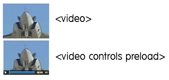
  1. <video controls preload>  
  2.     <source src="cohagenPhoneCall.ogv" type="video/ogg; codecs='vorbis, theora'" />  
  3.     <source src="cohagenPhoneCall.mp4" type="video/mp4; 'codecs='avc1.42E01E, mp4a.40.2'" />  
  4.     <p> Your browser is old. <a href="cohagenPhoneCall.mp4">Download this video instead.</a> </p>  
  5. </video>  
Chrome can correctly display video that is encoded in both the “ogg” and “mp4″ formats.
There are a few things worth noting here.
  1. We aren’t technically required to set the type attribute; however, if we don’t, the browser has to figure out the type itself. Save some bandwidth, and declare it yourself.
  2. Not all browsers understand HTML5 video. Below the source elements, we can either offer a download link, or embed a Flash version of the video instead. It’s up to you.
  3. The controls and preload attributes will be discussed in the next two tips.

18. Preload Videos

The preload attribute does exactly what you’d guess. Though, with that said, you should first decide whether or not you want the browser to preload the video. Is it necessary? Perhaps, if the visitor accesses a page, which is specifically made to display a video, you should definitely preload the video, and save the visitor a bit of waiting time. Videos can be preloaded by setting preload="preload", or by simply adding preload. I prefer the latter solution; it’s a bit less redundant.
  1. <video preload>  

19. Display Controls

If you’re working along with each of these tips and techniques, you might have noticed that, with the code above, the video above appears to be only an image, without any controls. To render these play controls, we must specify the controls attribute within the video element.
  1. <video preload controls>  
Options
Please note that each browser renders its player differently from one another.

20. Regular Expressions

How often have you found yourself writing some quickie regular expression to verify a particular textbox. Thanks to the new pattern attribute, we can insert a regular expression directly into our markup.
  1. <form action="" method="post">  
  2.     <label for="username">Create a Username: </label>  
  3.     <input type="text"  
  4.        name="username"  
  5.        id="username"  
  6.        placeholder="4 <> 10"  
  7.        pattern="[A-Za-z]{4,10}"  
  8.        autofocus  
  9.        required>  
  10.     <button type="submit">Go </button>  
  11. </form>  
If you’re moderately familiar with regular expressions, you’ll be aware that this pattern: [A-Za-z]{4,10} accepts only upper and lowercase letters. This string must also have a minimum of four characters, and a maximum of ten.
Notice that we’re beginning to combine all of these new awesome attributes!
If regular expressions are foreign to you, refer here.

21. Detect Support for Attributes

What good are these attributes if we have no way of determining whether the browser recognizes them? Well, good point; but there are several ways to figure this out. We’ll discuss two. The first option is to utilize the excellent Modernizr library. Alternatively, we can create and dissect these elements to determine what the browsers are capable of. For instance, in our previous example, if we want to determine if the browser can implement the pattern attribute, we could add a bit of JavaScript to our page:
  1. alert( 'pattern' in document.createElement('input') ) // boolean;  
In fact, this is a popular method of determining browser compatibility. The jQuery library utilizes this trick. Above, we’re creating a new input element, and determining whether the pattern attribute is recognized within. If it is, the browser supports this functionality. Otherwise, it of course does not.
  1. <script>  
  2. if (!'pattern' in document.createElement('input') ) {  
  3.     // do client/server side validation  
  4. }  
  5. </script>  
Keep in mind that this relies on JavaScript!

22. Mark Element

Think of the <mark> element as a highlighter. A string wrapped within this tag should be relevant to the current actions of the user. For example, if I searched for “Open your Mind” on some blog, I could then utilize some JavaScript to wrap each occurrence of this string within <mark> tags.
  1. <h3> Search Results </h3>  
  2. <p> They were interrupted, just after Quato said, <mark>"Open your Mind"</mark></p>  

23. When to Use a <div>

Some of us initially questioned when we should use plain-ole divs. Now that we have access to headers, articles, sections, and footers, is there ever a time to use a…div? Absolutely.
Divs should be utilized when there’s no better element for the job.
For example, if you find that you need to wrap a block of code within a wrapper element specifically for the purpose of positioning the content, a <div> makes perfect sense. However, if you’re instead wrapping a new blog post, or, perhaps, a list of links in your footer, consider using the <article> and <nav> elements, respectively. They’re more semantic.

24. What to Immediately Begin Using

With all this talk about HTML5 not being complete until 2022, many people disregard it entirely – which is a big mistake. In fact, there are a handful of HTML5 features that we can use in all our projects right now! Simpler, cleaner code is always a good thing. In today’s video quick tip, I’ll show you a handful of options.

25. What is Not HTML5

People can be forgiven for assuming that awesome JavaScript-less transitions are grouped into the all-encompassing HTML5. Hey — even Apple has inadvertently promoted this idea. For non-developers, who cares; it’s an easy way to refer to modern web standards. However, for us, though it may just be semantics, it’s important to understand exactly what is not HTML5.
  1. SVG: Not HTML5. It’s at least five years old.
  2. CSS3: Not HTML5. It’s…CSS.
  3. Geolocation: Not HTML5.
  4. Client Storage: Not HTML5. It was at one point, but was removed from the spec, due to the fact that many worried that it, as a whole, was becoming too complicated. It now has its own specification.
  5. Web Sockets: Not HTML5. Again, was exported to its own specification.
Regardless of how much distinction you require, all of these technologies can be grouped into the modern web stack. In fact, many of these branched specifications are still managed by the same people.

26. The Data Attribute

We now officially have support for custom attributes within all HTML elements. While, before, we could still get away with things like:
  1. <h1 id=someId customAttribute=value> Thank you, Tony. </h1>  
…the validators would kick up a fuss! But now, as long as we preface our custom attribute with “data,” we can officially use this method. If you’ve ever found yourself attaching important data to something like a class attribute, probably for JavaScript usage, this will come as a big help!

HTML Snippet

  1. <div id="myDiv" data-custom-attr="My Value"> Bla Bla </div>  

Retrieve Value of the Custom Attribute

  1. var theDiv = document.getElementById('myDiv');  
  2. var attr = theDiv.getAttribute('data-custom-attr');  
  3. alert(attr); // My Val  
It can also even be used in your CSS, like for this silly and lame CSS text changing example.
  1. <!DOCTYPE html>  
  2. <html lang="en">  
  3. <head>  
  4.    <meta charset="utf-8">  
  5.    <title>Sort of Lame CSS Text Changing</title>  
  6. <style>  
  7. h1 { position: relative; }  
  8. h1:hover { color: transparent; }  
  9. h1:hover:after {  
  10.     content: attr(data-hover-response);  
  11.     color: black;  
  12.     position: absolute;  
  13.     left: 0;  
  14. }  
  15. </style>  
  16. </head>  
  17. <body>  
  18. <h1 data-hover-response="I Said Don't Touch Me!"> Don't Touch Me  </h1>  
  19. </body>  
  20. </html>  
You can view a demo of the effect above on JSBIN.

27. The Output Element

As you probably have guessed, the output element is used to display some sort of calculation. For example, if you’d like to display the coordinates of a mouse position, or the sum of a series of numbers, this data should be inserted into the output element.
As a simple example, let’s insert the sum of two numbers into an empty output with JavaScript, when a submit button is pressed.
  1. <form action="" method="get">  
  2.     <p>  
  3.         10 + 5 = <output name="sum"></output>  
  4.     </p>  
  5.     <button type="submit"> Calculate </button>  
  6. </form>  
  7. <script>  
  8. (function() {  
  9.     var f = document.forms[0];  
  10.     if ( typeof f['sum'] !== 'undefined' ) {  
  11.         f.addEventListener('submit', function(e) {  
  12.             f['sum'].value = 15;  
  13.             e.preventDefault();  
  14.         }, false);  
  15.     }  
  16.     else { alert('Your browser is not ready yet.'); }  
  17. })();  
  18. </script>  
Try it out for yourself.
Please note that support for the output element is still a bit wonky. At the time of this writing, I was only able to get Opera to play nice. This is reflected in the code above. If the browser does not recognize the element, the browser will simply alert a notice informing you of as much. Otherwise, it finds the output with a name of “sum,” and sets its value to 15, accordingly, after the form has been submitted.
Output element
This element can also receive a for attribute, which reflects the name of the element that the output relates to, similar to the way that a label works.

28. Create Sliders with the Range Input

HTML5 introduces the new range type of input.
  1. <input type="range">  
Most notably, it can receive min, max, step, and value attributes, among others. Though only Opera seems to support this type of input right now fully, it’ll be fantastic when we can actually use this!
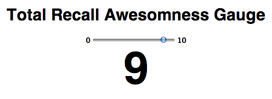
For a quick demonstration, let’s build a gauge that will allow users to decide how awesome “Total Recall” is. We won’t build a real-world polling solution, but we’ll review how it could be done quite easily.

Step 1: Mark-up

First, we create our mark-up.
  1. <form method="post">  
  2.     <h1> Total Recall Awesomness Gauge </h1>  
  3.     <input type="range" name="range" min="0" max="10" step="1" value="">  
  4.     <output name="result">  </output>  
  5. </form>  
Unstyled range input
Notice that, in addition to setting min and max values, we can always specify what the step for each transition will be. If the step is set to 1, there will then be 10 values to choose. We also take advantage of the new output element that we learned about in the previous tip.

Step 2: CSS

Next, we’ll style it just a bit. We’ll also utilize :before and :after to inform the user what our specified min and max values are. Thanks so much to Remy and Bruce for teaching me this trick, via “Introducing HTML5.”
  1. body {  
  2.     font-family'Myriad-Pro''myriad'helveticaarialsans-serif;  
  3.     text-aligncenter;  
  4. }  
  5. input { font-size14pxfont-weightbold;  }  
  6. input[type=range]:before { contentattr(min); padding-right5px; }  
  7. input[type=range]:after { contentattr(max); padding-left5px;}  
  8. output {  
  9.     displayblock;  
  10.     font-size: 5.5em;  
  11.     font-weightbold;  
  12. }  
Above, we create content before and after the range input, and make their values equal to the min and max values, respectively.
Styled Range

Step 3: The JavaScript

Lastly, we:
  • Determine if the current browser knows what the range input is. If not, we alert the user that the demo won’t work.
  • Update the output element dynamically, as the user moves the slider.
  • Listen for when the user mouses off the slider, grab the value, and save it to local storage.
  • Then, the next time the user refreshes the page, the range and output will automatically be set to what they last selected.
  1. (function() {  
  2.     var f = document.forms[0],  
  3.         range = f['range'],  
  4.         result = f['result'],  
  5.         cachedRangeValue = localStorage.rangeValue ? localStorage.rangeValue : 5;  
  6.     // Determine if browser is one of the cool kids that  
  7.     // recognizes the range input.  
  8.     var o = document.createElement('input');  
  9.     o.type = 'range';  
  10.     if ( o.type === 'text' ) alert('Sorry. Your browser is not cool enough yet. Try the latest Opera.');  
  11.     // Set initial values of the input and ouput elements to  
  12.     // either what's stored locally, or the number 5.  
  13.     range.value = cachedRangeValue;  
  14.     result.value = cachedRangeValue;  
  15.     // When the user makes a selection, update local storage.  
  16.     range.addEventListener("mouseup"function() {  
  17.         alert("The selected value was " + range.value + ". I am using local storage to remember the value. Refresh and check on a modern browser.");  
  18.         localStorage ? (localStorage.rangeValue = range.value) : alert("Save data to database or something instead.");  
  19.     }, false);  
  20.     // Display chosen value when sliding.  
  21.     range.addEventListener("change"function() {  
  22.         result.value = range.value;  
  23.     }, false);  
  24. })();  
Styled Range with JS
Ready for the real world? Probably not yet; but it’s still fun to play with and prep for!
Download the source code, and try it out for yourself. But use Opera.