Thanks again i'm back with a very helpful tutorial of Slider for Your Website. We’ll be using the popular Nivo Slider to handle the animation, so let’s dig in!
Let’s Dig In!
Alright, so assuming that you’ve gone through the design phase of this tutorial,
now you should have a pretty basic slider element in Photoshop (or
Fireworks) format. I’m going to write up this tutorial as a “standalone”
slider – meaning it’ll essentially be the only element on the page that
we create… but using just a few extra steps after the fact, you should
be able to add this to your own designs and position/resize it any way
that you want!
What’s better is that this is completely skinnable
and resizable – so if you’ve made any heavy customizations in the free
PSD that we handed out, you’ll be able to incorporate your
franken-modifications here as well!
Step 1: Download the Nivo Slider
Go ahead and download the latest version of the
Nivo Slider
from their page. The version we’ll be using is Version 2.4, but unless
they completely overhaul their entire codebase, chances are very good
that the steps in this tutorial will still work in version 2.5, 2.6, and
ever onward.
It’s important to note that
we’re not re-inventing the wheel here.
We’re pretty much just going to be using their “demo.html” file as our
own base of operations. We won’t deviate far from the official Usage
Documentation either.
As a web designer, I do a lot of work where
I’m simply modifying and hijacking other people’s open source code – you
probably do the same. It’s an important skill to have unless you’re
intent on learning each and every major coding language out there and
you’re willing to constantly keep your knowledge up to date. Frankly, I
think that’s kind of silly – so figuring out how to use other people’s
code is one of the most important skills that you can have.
In
most cases (as in this one), all that’s truly required is a rough
knowledge of HTML and CSS and the ability to read documentation.
We’ll start out the next step by opening up the “demo” folder – so go ahead and do that before we move on.
Step 2: Understanding the Basic Setup
In
this step, we’re simply going to attempt to get an idea for how the
Nivo Slider works. Every slider out there is going to work a little bit
different, so it’s worth taking a few minutes to familiarize yourself
with the particular script that you intend to use on a project.
If
you take a quick look at the code for the Nivo Slider (inside the
demo.html file), you’ll notice that all of the major styling and
structure is being handled from the “style.css” file. In fact, the
actual HTML code is pretty simple once you’ve referenced the appropriate
scripts in the HEAD section of demo.html.
Let’s start our
walkthrough by looking at the lines of code from the header. We won’t
need to change these, but they need to be present in any file that we
want to use the slider on:
-
- <link rel="stylesheet" href="nivo-slider.css" type="text/css" media="screen" />
- <script src="http://ajax.googleapis.com/ajax/libs/jquery/1.4.2/jquery.min.js"></script>
- <script src="jquery.nivo.slider.pack.js"></script>
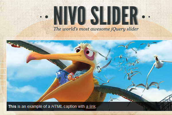
Next, let’s peek at the raw HTML that generates the slider:
-
- <div id="slider">
- <img src="images/slide1.jpg" alt="" />
- <a href="http://dev7studios.com">
- <img src="images/slide2.jpg" alt="" title="#htmlcaption" />
- </a>
- <img src="images/slide3.jpg" alt="" title="This is an example of a caption" />
- <img src="images/slide4.jpg" alt="" />
- </div>
Finally,
we won’t be dealing with captions in this particular slider, so you can
pretty much disregard the next lines (unless you want to do your own
customization of the slider later on):
- <div id="htmlcaption" class="nivo-html-caption">
- <strong>This</strong> is an example of a <em>HTML</em> caption with <a href="#">a link</a>.
- </div>
So,
really, all that’s required for you to understand is the basic HTML
that generates the slider (shown above in the second block of code).
Since we won’t be dealing with captions in our slider, you can further
simplify the code to something like this:
- <div id="slider-wrapper">
- <div id="slider">
- <img src="images/slide1.jpg" alt="" />
- <img src="images/slide2.jpg" alt="" />
- <img src="images/slide3.jpg" alt="" />
- <img src="images/slide4.jpg" alt="" />
- </div>
- </div>
That’s not so bad right? It’s essentially just a couple wrapped DIV elements with images inside.
The CSS for the Nivo Slider
The CSS is what’s going to be doing the heavy lifting, so let’s take a peek at that:
-
-
-
- #slider-wrapper {
- background:url(images/slider.png) no-repeat;
- width:998px;
- height:392px;
- margin:0 auto;
- padding-top:74px;
- margin-top:50px;
- }
-
- #slider {
- position:relative;
- width:618px;
- height:246px;
- margin-left:190px;
- background:url(images/loading.gif) no-repeat 50% 50%;
- }
- #slider img {
- position:absolute;
- top:0px;
- left:0px;
- display:none;
- }
- #slider a {
- border:0;
- display:block;
- }
-
- .nivo-controlNav {
- position:absolute;
- left:260px;
- bottombottom:-42px;
- }
- .nivo-controlNav a {
- display:block;
- width:22px;
- height:22px;
- background:url(images/bullets.png) no-repeat;
- text-indent:-9999px;
- border:0;
- margin-right:3px;
- float:left;
- }
- .nivo-controlNav a.active {
- background-position:0 -22px;
- }
-
- .nivo-directionNav a {
- display:block;
- width:30px;
- height:30px;
- background:url(images/arrows.png) no-repeat;
- text-indent:-9999px;
- border:0;
- }
- a.nivo-nextNav {
- background-position:-30px 0;
- rightright:15px;
- }
- a.nivo-prevNav {
- left:15px;
- }
-
- .nivo-caption {
- text-shadow:none;
- font-family: Helvetica, Arial, sans-serif;
- }
- .nivo-caption a {
- color:#efe9d1;
- text-decoration:underline;
- }
If
you’re new to CSS, this might look intimidating at first… but most of
you will see this for a fairly simple bit of styling code. Everything
you need to resize and reskin the slider is here… and we only need to
change a handful of lines of script to get this thing looking exactly
like our version.
First though, we need to locate and re-skin the
images that are currently being used for the slider with our own. If you
open up the “/demo/images/” folder, you’ll see there’s just a couple
main images that we want to reskin:
- arrows.png (the Left / Right arrows)
- bullets.png (the Dot indicators)
- slider.png (the background frame)
- background.png (optional)
- loading.png (optional)
Re-skinning the Assets
If
we were coding this slider from scratch, we’d probably start by
carefully chopping it in Photoshop, piece by piece. However, since we’re
working with a pre-existing set of “assets” (aka, the images used to
create the background, bullets and arrows), it’s going to make a little
bit more sense to skin the pre-existing assets rather than start from
scratch.
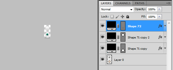
Reskin the Bullets
Let’s start with the
“bullets.png” file since it happens to be the most straight forward
file. Go ahead and open it up in Photoshop:
Notice
the basic structure of the file here. There are two graphics that will
be positioned using CSS so that one appears at a time.
We already
have our own bullet graphics from our own PSD, so we simply want to
position them over the original elements and re-save the file:
In
this case, we don’t even need to re-size the file at all… so we’re
actually done reskinning the bullets! Save this new file over the
original “bullets.png”.
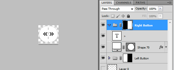
Reskin the Arrows
The arrows are
going to be one level more difficult, simply because our arrow graphics
are larger than the original graphics. That’s fine though – we’ll still
start by opening up the “arrows.png” file inside Photoshop.
It’s hard to see the arrows because they are transparent.
Once
again, notice the structure of the file – two arrows, side by side this
time – that will be positioned using CSS so that only one appears at a
time.
The size of the graphic is 60x30px… but ours will have to be
large enough to hold both of our bigger arrows. Having measured our own
arrows (you can do this using the Rectangular Marquee tool and the Info
panel), I’ve decided that the new dimensions should be 70x65px. This
will be large enough to hold both arrows, as well as the light shadow
that we want to appear next to each one.
We’re
going to have to make a few changes to the size and positioning in the
CSS, but this completes the initial reskin for the arrows. Save this new
file over the original “arrows.png”.
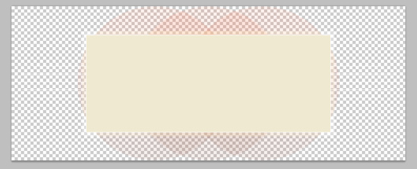
Reskin the Background
Lastly,
let’s re-skin the background graphic. The Nivo Slider demo uses an
abstract sort of circle background – but we want to use our “frame and
shadow” graphic for the background.
This swap is going to be
similar to what we did with the arrows, but instead of needing to make
our image larger, this time we actually need to save a smaller document.
Notice how large the original image is:
998x392px – Scaled Down for the Site.
998x392px
is the original background’s dimensions – We want it to be closer to
494x310px to match our own frame. This isn’t tough, but it’s a case
where it’s going to make more sense just to grab a direct slice from our
original PSD file.
Go ahead and turn off ALL layers (including
the background) other than the frame and the shadow, then Crop the image
down to about 20-25px of spacing around the frame just to be safe (we
won’t want to accidentally crop our shadow):
As with the last two graphics, go ahead and save directly over the original image “slider.png”.
Save Our Image Slides
The
original slider uses images that are 618×246 in size. Our slider uses
images that are 430x250px though, so we need to save over the original
slide images using our own cropped in versions. You can obviously use
your own images here… but for the sake of simplicity, I’ve just cropped
in the Pixar images that the demo used.
If you did want to use
your own images, obviously you’ll want to name them uniquely
(my_image1.jpg, my_image2.jpg, etc.), and then amend the image paths
inside the demo.html document.
Tweaking the CSS to Fit Our New Skinned Images
The
last step here is probably the trickiest as it requires a lot of trial
and error. Our objective is going to be to tweak the original style.css
file so that our slider matches our own design. The primary problem is
that the original slider uses completely different dimensions for most
of the major elements, so we need to carefully, through trial and error,
sort out what our own dimensions should be.
Trial and Error in
CSS can be done a few different ways – The “hard” way is to simply keep
on tweaking the CSS file, saving it, and then previewing it in the
browser. The easy way is to use a browser plugin like
Firebug to actually test out your adjustments in the browser itself. If you haven’t picked up
Firebug yet, I highly recommend doing so now. It’s a simple plugin that attaches to your browser.
I’m
going to simply dish out the completed CSS file right now, then we’ll
break it down step by step. I’ll mark every major line that was edited
with a “/*= NEW =*/” note:
-
-
-
- #slider-wrapper {
- background:url(images/slider.png) no-repeat;
- width:494px;
- height:310px;
- margin:0 auto;
- padding-top:23px;
- margin-top:50px;
- }
-
- #slider {
- position:relative;
- width:430px;
- height:250px;
- margin-left:32px;
- background:url(images/loading.gif) no-repeat 50% 50%;
- }
- #slider img {
- position:absolute;
- top:0px;
- left:0px;
- display:none;
- }
- #slider a {
- border:0;
- display:block;
- }
-
- .nivo-controlNav {
- position:absolute;
- left:163px;
- bottombottom:12px;
- background: #000000;
- -moz-border-radius: 10px;
- -webkit-border-radius: 10px;
- padding: 3px;
- border: 2px solid #CCC;
- opacity: 0.7;
- z-index: 99;
- }
-
- .nivo-controlNav:hover{opacity: 1;}
-
- .nivo-controlNav a {
- display:block;
- width:22px;
- height:22px;
- background:url(images/bullets.png) no-repeat;
- text-indent:-9999px;
- border:0;
- margin-right:0px;
- float:left;
- }
- .nivo-controlNav a.active {
- background-position:0 -22px;
- }
-
- .nivo-directionNav a {
- display:block;
- width:35px;
- height:65px;
- background:url(images/arrows.png) no-repeat;
- text-indent:-9999px;
- border:0;
- }
- a.nivo-nextNav {
- background-position:-35px 0;
- rightright: -40px;
- }
-
- a.nivo-nextNav:hover{rightright: -41px;}
-
- a.nivo-prevNav {
- left:-40px;
- }
- a.nivo-prevNav:hover{left: -41px;}
-
- .nivo-caption {
- text-shadow:none;
- font-family: Helvetica, Arial, sans-serif;
- }
- .nivo-caption a {
- color:#efe9d1;
- text-decoration:underline;
- }
-
- .nivo-directionNav a{top: 40%;}
Looking closely, you’ll notice that all of the changes (with the “/*= NEW =*/” note) fall into the same basic categories:
- Width
- Height
- Positioning (left, right, top, bottom)
The
only two exceptions are where we’ve added the background color and
rounded corners to the “.nivo-controlNav” element and where we’ve
adjusted the default positioning of the “.nivo-directionNav a” element
(this second one was previously set by another stylesheet, so we’re
overriding the default setting of 45% so our arrows are higher up on the
slider).
The other new rule that we’ve added is the “
a.nivo-prevNav:hover{left: -41px;}” rules for the left and right buttons. The purpose here is to add a subtle nudge to each button when you mouse over them.
If
you’re planning on creating your own resized version of the slider,
you’ll want to pay attention to the two spots where the overall height
and width of the slider are set. In short, the “#slider-wrapper” and
“#slider” elements are what control this – simply adjust the height and
width parameters to match your own slider’s dimensions and you should be
good to go.
Last Step – UnHiding the Left/Right Arrows
The
final modification that I’ve decided to make from the original
demo.html file is to unhide the arrow buttons. By default, the Nivo
Slide hides these “directional” navigation controls – only showing them
when your mouse is hovering over the slider. For us though, these
elements are a key aesthetic that we wouldn’t want to hide.
To
correct this, the Nivo Slider gives us a simple method of unhiding by
adding a single option to the activation script. At the bottom of the
demo.html file, find the following:
- <script>
- $(window).load(function() {
- $('#slider').nivoSlider();
- });
-
Now simply add the following option:
So that the revised code looks like this:
- <script>
- $(window).load(function() {
- $('#slider').nivoSlider({directionNavHide:false});
- });
-
-
- There is a full list of customizations that you can make through this method - check out the <a href="http://nivo.dev7studios.com/#usage" onclick="javascript:_gaq.push(['_trackEvent','outbound-article','nivo.dev7studios.com']);">Usage Page on Nivo Slider's</a> website for more notes.
Conclusion
That’s
it for this tutorial! While we haven’t coded a single thing from
scratch, we have effective created a custom slider and then realized it
in code using one of the best pre-built slider scripts out there on the
net right now. I hope you’ve picked up a few new skills in this
walkthrough – have fun customizing this and using it in your own design!